THE MIAMI BEACH NEW WORLD MUSIC CENTER 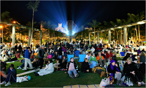
Review and principle photography by Jerome M. O’Connor
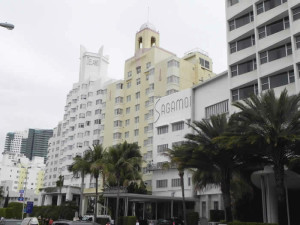
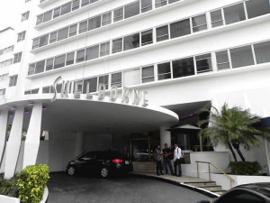
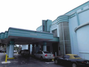
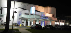
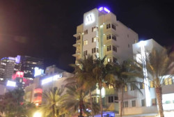
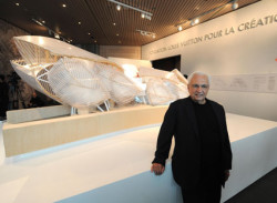
For Art Deco enthusiasts the jumble of tropically-hued 1930s Miami Beach Depression-era hotels flaunt a melodic zigzag of understated design and, sometimes, raucous color. Scores of jazz age buildings enclose a resurgent South Beach extending from Lincoln Road into a still Bohemian Espanola Way. But, until recently, South Beach’s eclectic energy quickly muted into bleak gaps of empty space and concrete shells, relieved by an occasional desolate city garage. Before deciding on an uncharacteristically sober design for his New World Center, Frank Gehry, the premier architect of the digital age, got his received wisdom from those same boarding houses, corner stores, and still vibrant small hotels. The result is a triumph for Miami Beach and for 21st Century architecture everywhere.
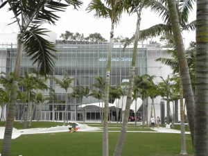
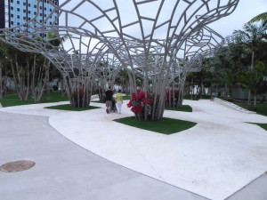
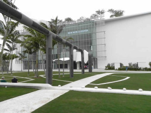
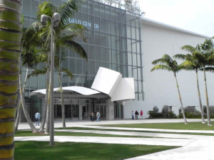
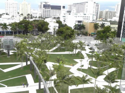
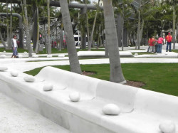
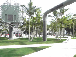
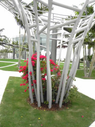
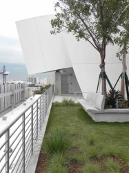
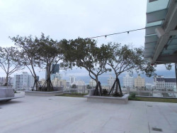
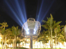
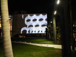
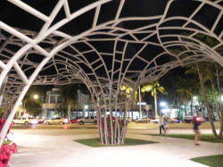
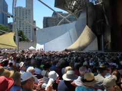
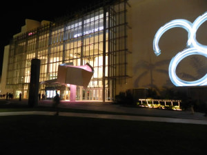
It begins with a walk through the adjacent 2.5 – acre pocket-park designed by the Dutch firm, West 8, and intended to complement Gehry’s stark white box at the opposite end. Design disagreements prevented his full control over the park’s final appearance, but the Gehry influence dominates in the sinuous twist of its pathways, trellis-like “trees,” and tubular modules enclosing lighting and speakers for outdoor concerts projected in HD on a 7,000 sq. ft. blazing white flat surface.
By integrating and connecting the indoor concert activity with the outdoor enthusiasm, Gehry became both a populist and a realist by extending the music to everyone, in or out. The free night-time concerts are heard from a phased-array audio system that covers the park with an undulating blanket of high quality surround-sound. Casually seated on chairs or at picnic tables, the outdoor groupings see and hear the same performance as the paying audience inside.
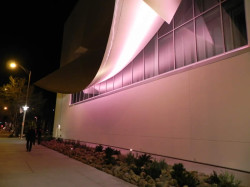
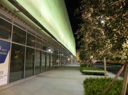
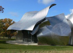
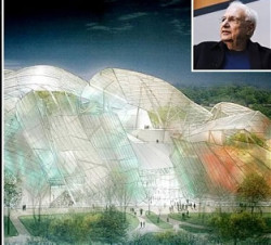
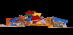
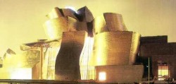
Yet, viewed from the park, the orchestra’s new home has a matronly, if not a slightly short of the needed final donations appearance. It just doesn’t look like Gehry’s celebrated color wheel of curvilinear, convex and concave sails, butts, cones, and flower petals. Then, get closer and it all changes. The 100,641 sq. ft. building is no pipsqueak and, at $154 million, it wasn’t cheap either. Indeed, many donors were asked to write multiple checks to get this show opened.
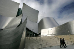
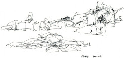
Before sitting at the drafting table Gehry closely viewed both the scruffy and the still visually happy concrete surroundings that portray the short but lively architectural expression between the world wars. But, going against type, instead of claiming new territory as he did so relentlessly in Bilbao, Los Angeles, and, especially, in Chicago, the 81- year old master artist temporized by adapting the music hall to its long established neighborhood. Viva la difference!
A NEW WORLD FOR A WORLD CLASS ORCHESTRA
Housed since its 1987 inception in a former Art Deco cinema on nearby Lincoln Road, the New World Symphony, led by Michael Tilson Thomas, may be America’s finest training orchestra. Its members must first graduate at the top of the class from famous music schools and then compete for a coveted place. Only thirty five are selected each year from over 1,000 applicants. Awarded an up to three year scholarship, the students are housed nearby and given a stipend as well as individualized instruction in state-of-the-art studios in the new Music Center. After multiple appearances during a 35-week season, most are eagerly snatched by the world’s leading symphony orchestras. Over 730 alumni have already made a difference worldwide. With the January 25, 2011 opening of the Music Center, they finally have a grand space in which to learn, rehearse, perform, and instantly connect through seventeen miles of fiber-optic cables to other rehearsal venues, orchestras and musicians worldwide.
A NEW WORLD OF DESIGN
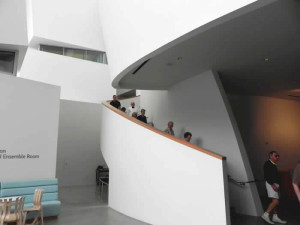
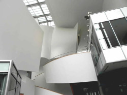
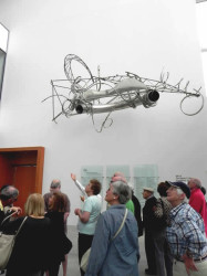
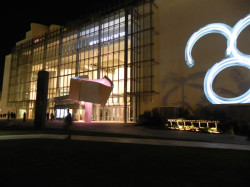
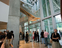
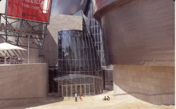
The intended solemnity of the exterior rapidly evolves into an interior of poise and clarity, including a single semi-obligatory Gehry whimsy near the entrance. What could be a sail or a petal or a music sheet blowing in the wind is actually a marquee defining the entrance and box office. Inside, just past invitingly wide and tall windows begins a kind of purposeful performance certain to inspire awe and smiles. The undulating shapes, curves, and architectural fun could only come from the Gehry palette.
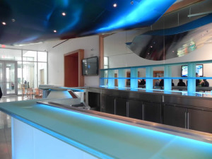
About the only color splash in the lobby – and it’s a dominant one – seems to ever enlarge from a brilliant-blue laminated and frosted glass-topped bar illuminated from above and inside. It’s a powerful invitation to drink. Bartender, a Blue Martini please. Make it two.
Now begins the adventure – and shouldn’t the experience of music be an exploration? Symphony orchestras of the world unite and get, well, get on the bandwagon, and re-engage audiences that continue to exit stage left from performance art’s most complete form of expression and participation. In the still forming digital age too many modern audience’s seek easier forms of entertainment. Thus, begin the process of enrichment and total immersion right here.
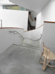
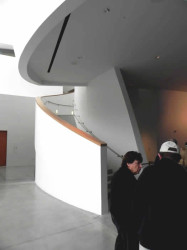
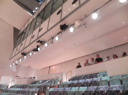
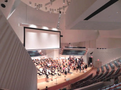
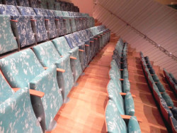
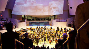
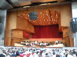
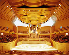
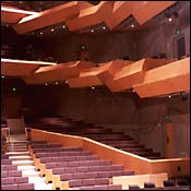
Start with a Gehry indulgence as the audience ascends corkscrewing stairs (handicapped accessible elevators available) to one of six levels into a snug 756-seat auditorium. It’s almost like walking the narrow, inclined streets of Assisi, minus the stores selling relics. Then, a centuries old theatrical ruse of concentrating an audience on only a few narrow entrances to the interior, the better to dramatize the space. It’s practiced to perfection at Adler and Sullivan’s majestic Auditorium in Chicago. In Miami Beach, only two entries suddenly reveal an all-enveloping space with a panoramic view. The white on white interior, accented by varieties of maple and cedar flooring, are further enhanced by Gehry-designed sound-absorbing seats – the only dominant colors. It’s akin to viewing rows of sprinkled cream puffs in a bakery window.
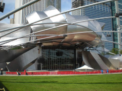
Echoing Chicago’s vaunted Pritzker Pavilion at Millennium Park, irregularly shaped and placed convex and concave panels dominate the wide stage like a comforting plaster quilt, enclosing the audience in a warm white hug.
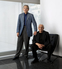
More than simple art, the panels do double-duty as acoustic reflectors and screens for programs using projected images or film. Designed by Japanese acoustician Yasuhisa Toyota, the panels, stage risers, even the first five audience rows, can be adjusted for performance challenges, such as a delicate Bach partita or a mighty Mahler symphony. Ever vigilant about the high value of acoustics, Toyota chose Alaskan cedar for the stage flooring, the better to deeply resonate the sound into an audience where every seat is sweet.
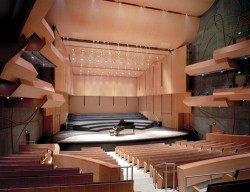
For some concerts the audience becomes part of the program, as performers are placed on projecting ledges within the audience seating area. Consider a musician hefting a Wagner tuba suddenly appearing for a toot near you during the Bruckner #7.
By comparing the New World Music Center with other theatres, most of which are shoe-box-shaped and audience unfriendly, Gehry sided with the people by bringing the performance to the listeners and by taking the audience into the music. It’s a deliberately egalitarian intention certain to charm listeners and musicians alike within a dynamic, almost hypnotic setting. By redefining the purpose and place for music and its followers, Gehry opened a big tent that billows with energy and animation. And, by showing that white can be warm, this stacked tumble of kinetic movement firmly establishes Gehry as the master of modernism.
